Mar 27, 2019
Web Components will replace your frontend framework
The native web platform has caught up with frontend frameworks and will slowly render them obsolete.

Remember when document.querySelector first got wide browser support and started to end jQuery's ubiquity? It finally gave us a way to do natively what jQuery had been providing for years: easy selection of DOM elements. I believe the same is about to happen to frontend frameworks like Angular and React.
These frameworks have enabled us to do what we always wanted but never were able to: creating reusable autonomous frontend components, but at the cost of added complexity, proprietary syntax and increased payloads.
This is about to change.
The modern Web API has evolved to the point where you don’t necessarily need a framework anymore to create reusable frontend components. Custom Elements and Shadow DOM are all you need to create autonomous components that can be reused anywhere.
Originally introduced in 2011, Web Components are a set of features which allow for the creation of reusable components using just HTML, CSS and JavaScript. This means you can create your components without the use of a framework like React or Angular. Even better, these components can all be seamlessly integrated into these frameworks.
For the first time in history we are able to create reusable components that can run in any modern browser, using just HTML, CSS and JavaScript. Web Components are now natively supported in recent versions of Chrome, Safari, Firefox and Opera on desktop, Safari on iOS and Chrome on Android.
Edge will offer support in the upcoming version 19. For older browsers there’s a polyfill which enables Web Components down to IE11.
This means you can use Web Components today in basically any browser, including mobile.
Create your own custom HTML tags that inherit all properties of the HTML elements they extend and which you can use in any supporting browser by simply importing a script. All HTML, CSS and JavaScript defined inside the component is fully scoped to the component itself.
The component will show up as a single HTML tag in your browser’s dev tools with its styling and behaviour fully encapsulated, no workarounds, frameworks or transpiling needed.
Let’s take a look at the main features of Web Components.
Custom Elements
Custom Elements are simply user-defined HTML elements. They are defined using the CustomElementRegistry. To register a new element, get an instance of the registry through window.customElements and call its define method:
window.customElements.define('my-element', MyElement);
The first argument to the definemethod is the tag name of our newly created element. We can now use it by simply adding:
<my-element></my-element>
The dash (-) in the name is mandatory to avoid name collisions with any native HTML elements.
The MyElement constructor is required to be an ES6 class which is unfortunate since JavaScript classes are not (yet) like traditional OOP classes and can be confusing. Also, if an Object would be allowed then a Proxy could also be used, enabling simple databinding for Custom Elements. However, this restriction is needed to enable the extension of native HTML elements and ensures your element inherits the entire DOM API.
Let’s write the class for our custom element:
class MyElement extends HTMLElement {
  constructor() {
    super();
  }

  connectedCallback() {
    // here the element has been inserted into the DOM
  }
}
The class for our custom element is just a regular JavaScript class which extends the native HTMLElement. In addition to its constructor it has a method called connectedCallback which is called when the element has been inserted into the DOM tree. You can compare this to React's componentDidMount method.
In general, setting up the component should be deferred to connectedCallback as much as possible, since this is the only place where you are certain that all attributes and children of the element will be available. The constructor should in general only be used to initialize state and set up Shadow DOM.
The difference between the element’s constructor and connectedCallback is that the constructor is called when the element is created (for example by a call to document.createElement) and connectedCallback is called when the element has actually been inserted into the DOM, for example when the document in which it is declared has been parsed or it has been added with document.body.appendChild.
You can also construct the element by getting a reference to its constructor with a call to customElements.get('my-element'), provided it was already registered with customElements.define(). You can then instantiate your element with new element() instead of document.createElement():
customElements.define('my-element', class extends HTMLElement {

   ...

});

const el = customElements.get('my-element');
const myElement = new el();  // same as document.createElement('my-element');

document.body.appendChild(myElement);
The counterpart of connectedCallback is disconnectedCallback, which is called when the element is removed from the DOM. This method will allow you to do any necessary cleanup work, but keep in mind that this method will not be called when the user closes the browser or a browser tab for example.
There is also adoptedCallback which is called when the element is adopted into the document by calling document.adoptNode(element). So far, I have never encountered a use-case for this callback.
Another useful lifecycle method is attributeChangedCallback. This will be called whenever an attribute changes that has been added to the observedAttributes array. The method is called with the name of the attribute, its old value and its new value:
class MyElement extends HTMLElement {
  static get observedAttributes() {
    return ['foo', 'bar'];
  }

  attributeChangedCallback(attr, oldVal, newVal) {
    switch(attr) {
      case 'foo':
        // do something with 'foo' attribute

      case 'bar':
        // do something with 'bar' attribute
    }
  }
}
This callback will only be called for attributes that are present in the observedAttributes array, in this case foo and bar. For any other attribute that changes, the callback will not be called.
Attributes are primarily used to declare the initial configuration/state of the element. In theory it would be possible to pass complex values to attributes by serializing them, but this could hurt performance and since you have access to the component’s methods you won’t need this. If you do however want to have databinding through attributes as provided by frameworks like React and Angular, you could have a look at Polymer.
The order of lifecycle methods
The order in which the lifecycle methods are executed is:
constructor -> attributeChangedCallback -> connectedCallback
Why would the attributeChangedCallback be executed before the connectedCallback?
Recall that the primary purpose of attributes on web components is initial configuration. This means that this configuration needs to be available when the component is inserted into the DOM so attributeChangedCallback needs to be called before connectedCallback.
This means that if you need to configure any nodes inside the Shadow DOM based on the values of certain attributes, you need to reference these already in the constructor and not in connectedCallback.
For example, if you have an element with id="container" inside your component and you need to need to give this element a grey background whenever the observed attribute disabled changes, reference this element already in constructor so it will be available in attributeChangedCallback:
constructor() {
  this.container = this.shadowRoot.querySelector('#container');
}

attributeChangedCallback(attr, oldVal, newVal) {
  if(attr === 'disabled') {
    if(this.hasAttribute('disabled') {
      this.container.style.background = '#808080';
    }
    else {
      this.container.style.background = '#ffffff';
    }
  }
}
If you would have waited until connectedCallback to create this.container then it would not yet be available the first time attributeChangedCallback is called. So although you should defer setup of your component to connectedCallback as much as possible, this is a case where this is not possible.
It is also important to realize that you can use a web component before it has been registered with customElements.define(). When the element is present in the DOM or inserted into it and it has not (yet) been registered it will be an instance of HTMLUnknownElement. The browser will treat any HTML element it does not know as such and you can interact with it just like any other element, besides that it won't have any methods or default styling.
When it is then registered through customElements.define() it is enhanced with the class definition. This process is called upgrading. You can invoke a callback when an element is upgraded with customElements.whenDefined which returns of Promise that resolves when the element is upgraded:
customElements.whenDefined('my-element')
.then(() => {
  // my-element is now defined
})
The public API of a Web Component
Besides these lifecycle methods, you can define methods on your element which can be called from the outside, something which is currently not possible with elements defined using frameworks like React or Angular. For example, you could define a method called doSomething:
class MyElement extends HTMLElement {

  ...

  doSomething() {
    // do something in this method
  }
}
And call it from outside the component like this:
const element = document.querySelector('my-element');
element.doSomething();
Any method you define on your element becomes part of its public JavaScript API. This way you can implement databinding by providing setters for properties of the element which will for example render the property value in the element’s HTML. Since it is not natively possible to give any other values than strings to attributes, complex values like objects should be passed to custom elements as properties.
Besides for declaring the initial state of a web component, attributes are also used to reflect the value of the corresponding property to so the JavaScript state of the element is reflected to its DOM representation. An example of this is the disabled attribute of the input element:
<input name="name">

const input = document.querySelector('input');
input.disabled = true;
After setting the input’s property disabled property to true, this change will be reflected to the corresponding disabled attribute:
<input name="name" disabled>
Implementing reflecting a property to an attribute can easily be done through a setter:
class MyElement extends HTMLElement {

  ...

  set disabled(isDisabled) {
    if(isDisabled) {
      this.setAttribute('disabled', '');
    }
    else {
      this.removeAttribute('disabled');
    }
  }

  get disabled() {
    return this.hasAttribute('disabled');
  }
}
When you need to perform some action when an attribute changes, add it to the observedAttributes array. As a performance optimization, only attributes listed here will be observed for changes. Whenever the value of the attribute changes attributeChangedCallback will be called with the name of the attribute, its current value and its new value:
class MyElement extends HTMLElement {
  static get observedAttributes() {
    return ['disabled'];
  }

  constructor() {
    const shadowRoot = this.attachShadow({mode: 'open'});

    shadowRoot.innerHTML = `
      <style>
        .disabled {
          opacity: 0.4;
        }
      </style>

      <div id="container"></div>
    `;

    this.container = this.shadowRoot('#container');
  }

  attributeChangedCallback(attr, oldVal, newVal) {
    if(attr === 'disabled') {
      if(this.disabled) {
        this.container.classList.add('disabled');
      }
      else {
        this.container.classList.remove('disabled')
      }
    }
  }
}
Now whenever the disabled attribute changes the class “disabled” is toggled on this.container, which is a div element inside the element's Shadow DOM.
Let’s have a closer look at this.
Shadow DOM
Using Shadow DOM, a custom element’s HTML and CSS are fully encapsulated inside the component. This means that the element will show up as a single HTML tag in the document’s DOM tree with its internal HTML structure placed inside a #shadow-root.
In fact Shadow DOM is also used by several native HTML elements. When for example you have a <video> element in an webpage it will show up as a single tag but it will also display controls to play and pause the video that are not visible when you inspect the <video> element in the browser's dev tools.
These controls are in fact part of the <video> element's Shadow DOM and are therefore hidden by default. To reveal the Shadow DOM in Chrome, go to "Preferences" inside the dev tools Settings and check the checkbox "Show user agent Shadow DOM". When you inspect the video element again in dev tools, you will now see and be able to inspect the element's Shadow DOM.
Shadow DOM also provides truly scoped CSS. All CSS defined inside the component only applies to the component itself. The element will only inherit a minimum amount of properties from the CSS defined outside the component and even these properties can be configured to not inherit any values from the surrounding CSS. You can however expose CSS properties to allow consumers to style the component. This solves a whole lot of current CSS problems while still allowing custom styling of the component.
To define a Shadow root:
const shadowRoot = this.attachShadow({mode: 'open'});
shadowRoot.innerHTML = `<p>Hello world</p>`;
This defines a Shadow root with mode: 'open' which means it can be inspected in dev tools and interacted with, either by querying it, configuring any exposed CSS properties or listening to events it throws. It is also possible to define the Shadow root with mode: 'closed' which is not recommended since it will not allow the consumer of the component to interact with it in any way; you won't even be able to listen to events it throws.
To add HTM to the Shadow root you can assign an HTML string to its innerHTML property or use a <template> element. An HTML template is basically an inert HTML fragment that you can define for later use. It will not be visible or parsed until it is actually inserted into the DOM tree, which means that any external resources defined inside it will not be fetched and any CSS and JavaScript will not be parsed until you insert it into the DOM. When the HTML of your component changes based on its state you could for example define multiple <template> elements that you can insert based on the component's state. This allows you to easily change large parts of the component's HTML without having to fiddle around with individual DOM nodes.
When the Shadow root has been created you can use all DOM methods on it you would normally use on the document object, for example this.shadowRoot.querySelector to find an element. All CSS for the component is defined inside a <style> tag but you could also fetch an external stylesheet if you wanted to using a regular <link rel="stylesheet"> tag. In addition to regular CSS you can use the :host selector to style the component itself. For example, custom elements use display: inline by default so to display the component as a block element you could use:
:host {
  display: block;
}
This also allows you to do contextual styling. For example, if you want to show your component as grayed out when it has a disabled attribute defined, use:
:host([disabled]) {
  opacity: 0.5;
}
By default custom elements inherit a few properties from the surrounding CSS, for example color and font among others. If however you want to start with a clean slate and have all CSS properties reset to their default values inside your component, use:
:host {
  all: initial;
}
It’s important to note that styles defined on the component itself from the outside have precedence over the styling defined in Shadow DOM with :host. So if you would define:
my-element {
  display: inline-block;
}
it would override:
:host {
  display: block;
}
It is not possible to style any nodes inside a custom element from the outside. If however you want consumers to be able to style (parts of) your component you can expose CSS variables to do so. For example, if you want consumers to be able to pick the background color of your component you can expose a CSS variable called --background-color.
Let’s say the root node of the Shadow DOM inside your component is <div id="container">:
#container {
  background-color: var(--background-color);
}
Now consumers of your component can set its background color from the outside:
my-element {
  --background-color: #ff0000;
}
You should set a default value for it inside the component in case it is not defined by the consumer:
:host {
  --background-color: #ffffff;
}

#container {
  background-color: var(--background-color);
}
Of course you can pick any name you want for your CSS variables. The only requirement for CSS variables is that they start with ‘- -‘.
By providing scoped CSS and HTML, Shadow DOM solves the specificity issues that come with the global nature of CSS and that usually result in huge addition-only stylesheets, packed with increasingly specific selectors and overrides. Shadow DOM makes it possible to bundle markup and styling into self-contained components without any tooling or naming conventions. You will never have to worry again whether a new class or id will conflict with any existing ones.
Besides being able to style the internals of web components through CSS variables, it is also possible to inject HTML into web components.
Composition through slots
Composition is the process of composing the Shadow DOM tree together with user-provided markup. This is done through the <slot> element which is basically a placeholder in Shadow DOM where markup provided by the user is rendered. The markup the user provides is called light DOM. Composition composes the light DOM and Shadow DOM together into a new DOM tree.
For example, you could create an <image-gallery> component and provide standard <img> tags as content for the component to render:
<image-gallery>
  <img src="foo.jpg" slot="image">
  <img src="b.arjpg" slot="image">
</image-gallery>
The component will now take the two provided images and render them inside the component’s Shadow DOM using slots. Notice the slot="image" attribute on the images. This tells the component where they should be rendered inside its Shadow DOM, which could for example look like this:
<div id="container">
  <div>
    <slot name="image"></slot>
  </div>
</div>
And when the nodes inside the light DOM have been distributed into the element’s Shadow DOM the resulting DOM tree will look like this:
<div id="container">
  <div>
    <slot name="image">
      <img src="foo.jpg" slot="image">
      <img src="bar.jpg" slot="image">
    </slot>
  </div>
</div>
As you can see any user-provided element that has a slot attribute will be rendered inside the slot element that has a name attribute with a value corresponding with the value of the slot attribute.
The humble <select> element works in exactly the same way which you can see when you inspect it in Chrome dev tools (when you have Show user agent Shadow DOM selected, see above):
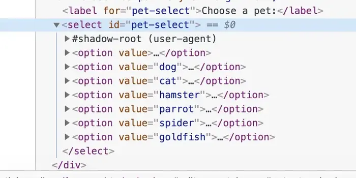
It takes the <option> elements the user provides and renders them into a dropdown menu.
Slot elements with a name attribute are called named slots, but this attribute is not required. It is merely used to render content in a specific place. When one or more slots do not have a name attribute, content will just be rendered inside them in the order in which it is provided by the user. Slots can even provide fallback content when the user provides less content than slots.
Let’s say the Shadow DOM of the <image-gallery> looks like this:
<div id="container">
  <div>
    <slot></slot>
    <slot></slot>
    <slot>
      <strong>No image here!</strong> <-- fallback content -->
    </slot>
  </div>
</div>
When it is given the same two images again, the resulting DOM tree will look like this:
<div id="container">
  <div>
    <slot>
      <img src="foo.jpg">
    </slot>
    <slot>
      <img src="bar.jpg">
    </slot>
    <slot>
     <strong>No image here!</strong>
    </slot>
  </div>
</div>
The elements that are rendered inside Shadow DOM through slots are called distributed nodes. All styling that was applied to these nodes before they were rendered inside the component’s Shadow DOM (distributed) will also apply after distribution. Inside the Shadow DOM, distributed nodes can get additional styling through the ::slotted() selector:
::slotted(img) {
  float: left;
}
::slotted() can take any valid CSS selector but it can only select top-level nodes. For example ::slotted(section img) won't work with this content:
<image-gallery>
  <section slot="image">
    <img src="foo.jpg">
  </section>
</image-gallery>
Working with slots in JavaScript
You can interact with slots through JavaScript by inspecting which nodes have been assigned to a certain slot, which slot a certain element has been assigned to and the slotchange event.
To find out which elements have been assigned to a slot call slot.assignedNodes(). If you also want to retrieve any fallback content, call slot.assignedNodes({flatten: true}).
To find out which slot a certain element an element has been assigned to, inspect element.assignedSlot.
The slotchange event is fired whenever the nodes inside a slot change, meaning when a node is added or deleted. Note that the event is only fired for the slotted nodes themselves and not for children of these slotted nodes.
slot.addEventListener('slotchange', e => {
  const changedSlot = e.target;
  console.log(changedSlot.assignedNodes());
});
Chrome fires the slotchange event when the element is first initialized whereas Safari and Firefox do not.
Events in Shadow DOM
Standard events coming from custom elements like Mouse and Keyboard Events will by default bubble up from the Shadow DOM. Whenever an event comes from a node inside Shadow DOM it will be retargeted so the event appears to be coming from the custom element itself. If you want to find out which element inside the Shadow DOM the event actually came from, you can call event.composedPath() to retrieve an array of nodes the event traveled through. The target property of the event will however always point to the custom element itself.
You can throw any event you want from a custom element by using CustomEvent.
class MyElement extends HTMLElement {

  ...

  connectedCallback() {
    this.dispatchEvent(new CustomEvent('custom', {
      detail: {message: 'a custom event'}
    }));
  }
}

// on the outside
document.querySelector('my-element').addEventListener('custom', e => {
  console.log('message from event:', e.detail.message);
});
However when an event is thrown from a node inside the Shadow DOM instead of the custom element itself it will not bubble up out of Shadow DOM unless it is created with composed: true:
class MyElement extends HTMLElement {

  ...

  connectedCallback() {
    // dispatchEvent is now called on this.container instead of this
    this.container = this.shadowRoot.querySelector('#container');

    this.container.dispatchEvent(new CustomEvent('custom', {
      detail: {message: 'a custom event'},
      composed: true  // without composed: true this event will not bubble out of Shadow DOM
    }));
  }
}
The template element
In addition to using this.shadowRoot.innerHTML to add HTML to an element's shadow root, you can use a <template> element to do so. A template holds HTML for later use. It is not rendered and it is initially only parsed to ensure its contents are valid. JavaScript inside a template is not executed and any external resources are not fetched. By default it is hidden.
When a web component needs to render entirely different markup based on different situations, different templates can be used to accomplish this:
class MyElement extends HTMLElement {

  ...

  constructor() {
    const shadowRoot = this.attachShadow({mode: 'open'});

    this.shadowRoot.innerHTML = `
      <template id="view1">
        <p>This is view 1</p>
      </template>

      <template id="view1">
        <p>This is view 1</p>
      </template>

      <div id="container">
        <p>This is the container</p>
      </div>
    `;
  }

  connectedCallback() {
    const content = this.shadowRoot.querySelector('#view1').content.cloneNode(true);
    this.container = this.shadowRoot.querySelector('#container');

    this.container.appendChild(content);
  }
}
Here both templates are placed inside the shadow root of the element using innerHTML. Initially both templates are hidden and only the container is rendered. Inside connectedCallback we get the contents of #view1 with this.shadowRoot.querySelector('#view1').content.cloneNode(true). The content property of the template returns the contents of the template as a DocumentFragment which can be added to another element using appendChild. Since appendChild will move an element when it is already present in the DOM we need to clone it first using cloneNode(true). Otherwise the contents of the template will be moved instead of appended which means we would only be able to use it once.
Templates are very useful for quickly changing large parts of HTML or for reusing markup. They are not limited to web components and can be used anywhere in the DOM.
Extending native elements
So far we have been extending the HTMLElement to create an entirely new HTML element. Custom Elements also allow for extending native built-in elements, enabling the enhancing of already existing HTML elements like images and buttons for example. At the time of writing this feature is only supported in Chrome and Firefox.
The benefit of extending existing HTML elements is that all properties and methods of the element are inherited. This allows for progressive enhancement of existing elements which means that even if the element is loaded in a browser that does not support Custom Elements, it will still be usable. It will simply fallback to its default built-in behaviour, while if it had been an entirely new HTML tag, it would not be usable at all.
As an example, let’s say we want to enhance the HTML <button> element:
class MyButton extends HTMLButtonElement {

  ...

  constructor() {
    super();  // always call super() to run the parent's constructor as well
  }

  connectedCallback() {
    ...
  }

  someMethod() {
    ...
  }
}

customElements.define('my-button', MyButton, {extends: 'button'});
Instead of extending the more generic HTMLElement, our web component now extends HTMLButtonElement. The call to customElements.define now also takes an additional argument {extends: 'button'} to indicate that our class extends the <button> element. This might seem redundant since we already indicate we want to extend the HTMLButtonElement, but is necessary since there are elements which share the same DOM interface. For example, both <q> and <blockquote> both share the HTMLQuoteElement interface.
The enhanced button can now be used with the is attribute:
<button is="my-button">
It will now be enhanced by our MyButton class and in case it is loaded in a browser that doesn't support Custom Elements it will simply fallback to a standard button, true progressive enhancement!
Note that when extending existing elements, Shadow DOM can’t be used. This is simply a way of extending native HTML element by inheriting all their existing properties, methods and events and providing additional functionality. It is of course possible to modify the element’s DOM and CSS from within the component but trying to create a shadow root will throw an error.
Another benefit of extending built-in elements is that these can also be used in places where element child restrictions apply. The <thead> element for example is only allowed to have <tr> elements as its children, so an <awesome-tr> element for example would render invalid markup. In that case we could extend the built-in <tr> element and use it like this:
<table>
  <thead>
    <tr is="awesome-tr"></tr>
  </thead>
</table>
This way of creating web components brings great progressive enhancement, but as mentioned, at the moment this is only implemented by Chrome and Firefox. Edge will also implement it, but at the time of writing Safari will unfortunately not implement this.
Testing web components
Testing web components is easy and straightforward and frankly a breeze compared to writing tests for frameworks like Angular and React. There is no transpiling or complicated setup needed. Just create the element, append it to the DOM and run your tests.
Here’s an example of a test using Mocha:
import 'path/to/my-element.js';

describe('my-element', () => {
  let element;

  beforeEach(() => {
    element = document.createElement('my-element');

    document.body.appendChild(element);
  });

  afterEach(() => {
    document.body.removeChild(element);
  });

  it('should test my-element', () => {
    // run your test here
  });
});
Here the first line imports the my-element.js file which exposes our web component as an ES6 module. This means that the test file itself also needs to be loaded as an ES6 module in the browser. This requires the following index.html to be able to run the tests in a browser. In addition to Mocha, this setup also loads the WebcomponentsJS polyfill, Chai for test assertions and Sinon for spies and mocks:
<!doctype html>
<html>
    <head>
        <meta charset="utf-8">
        <link rel="stylesheet" href="../node_modules/mocha/mocha.css">
        <script src="../node_modules/@webcomponents/webcomponentsjs/webcomponents-loader.js">
        </script>
        <script src="../node_modules/sinon/pkg/sinon.js"></script>
        <script src="../node_modules/chai/chai.js"></script>
        <script src="../node_modules/mocha/mocha.js"></script>
        <script>
            window.assert = chai.assert;
            mocha.setup('bdd');
        </script>
        <script type="module" src="path/to/my-element.test.js"></script>
        <script type="module">
            mocha.run();
        </script>
    </head>
    <body>
        <div id="mocha"></div>
    </body>
</html>
After loading the needed scripts we expose chai.assert as a global variable so we can simply use assert() in our tests and setup Mocha to use the BDD interface. Then the test files are loaded (only one in this case) and we run the tests with a call to mocha.run().
Note that when using ES6 modules it is also necessary to place mocha.run() inside a script with type="module". This is because ES6 modules are deferred by default and if mocha.run() is placed inside a regular script tag it will be executed before my-element.test.js is loaded.
Polyfilling older browsers
Custom Elements are now supported in recent versions of Chrome, Firefox, Safari and Opera on desktop and will be supported in the upcoming Edge 19. On iOS and Android they are supported in Safari, Chrome and Firefox.
For older browsers there is the WebcomponentsJS polyfill which can be installed through:
npm install --save @webcomponents/webcomponentsjs
You can include the webcomponents-loader.js file which will do feature detection to only load the necessary polyfills. Using this polyfill you can use Custom Elements without having to add anything to the source code. However, it does not provide truly scoped CSS, meaning that if you have the same classnames and ids in different web components and load them in the same document, they will conflict. Also, the Shadow DOM CSS selectors :host() and :slotted() may not work as expected.
For this to work correctly you will need to use the Shady CSS polyfill which also means you will have to (slightly) alter your source code to use it. I personally found this undesirable so I created a webpack loader which will handle this for you. It does mean that you will have to transpile but you can leave your code untouched.
The webpack loader does three things: it prefixes all CSS rules inside the Shadow DOM of your web component that do not start with ::host or ::slotted with the tagname of the element to provide proper scoping. After that it parses all ::host and ::slotted rules to make sure these also work correctly.
Working example #1: lazy-img
I have created a web component which lazily loads an image once it is fully visible in the browser’s viewport. You can find it on Github.
The main version of the component wraps the native <img> tag inside a <lazy-img> Custom Element:
<lazy-img
  src="path/to/image.jpg"
  width="480"
  height="320"
  delay="500"
  margin="0px"></lazy-img>
The repo also contains the extend-native branch which contains lazy-img that extends the native <img> tag using the is attribute:
<img
  is="lazy-img"
  src="path/to/img.jpg"
  width="480"
  height="320"
  delay="500"
  margin="0px">
This is a good example of the power of native web components: simply import the JavaScript file, add the HTML tag or extend a native one with the is attribute and you're in business!
Working example #2: material-webcomponents
I implemented Google’s Material Design using Custom Elements, also available on Github.
This library also showcases the power of CSS custom properties, which it uses heavily.
So, should I ditch my framework?
Well as always, it depends.
The current frontend frameworks bring added value with features like databinding, state management and a fairly standardised codebase. The question is whether your application really needs this.
If you need to ask yourself if your application really needs state management like Redux, you probably don’t need it. You will know when you do.
You will probably benefit from using databinding, but for non-primitive values like arrays and objects native web components already allow you to set properties directly. Primitive values can be set on attributes and changes to these attributes can be observed through the attributeChangedCallback.
While this approach makes perfect sense, it can make only updating small parts of the DOM cumbersome and verbose compared to the declarative way in which React and Angular allow you to do this. These frameworks allow to define a view containing expressions that are updated when they are changing.
Native web components do not provide such functionality (yet) although there is a proposal to extend the <template> element to allow it to be instantiated and updated with data:
<template id="example">
  <h1>{{title}}</h1>
  <p>{{text}}</p>
</template>

const template = document.querySelector('#example');
const instance = template.createInstance({title: 'The title', text: 'Hello world'});

shadowRoot.appendChild(instance.content);

//update
instance.update({title: 'A new title', text: 'Hi there'});
A currently available library that provides efficient DOM updating is lit-html.
Another often mentioned benefit of frontend frameworks as that they provide a standard codebase that each new developer on the team will be familiar with from the beginning. While I believe this is true, I also think this benefit is quite limited.
I have worked on a variety of projects using Angular, React and Polymer and while there is definitely familiarity, these codebases were significantly different despite using the same framework. A clearly defined way of work and style guide will do more for the consistency of your codebase than simply using a framework. Frameworks also bring added complexity, ask yourself if this is really worth it.
Now that web components are widely supported you might come to the conclusion that native code can bring you the same functionality that frameworks bring, but with better performance, less code and less complexity.
The benefits of native web components are clear:
jQuery and its tremendously wonderful legacy will be around for a while but you won’t find too many new projects being built with it since there are now better options. I don’t expect the current frameworks disappearing any time soon but better options in the form of native web components are on the horizon and gaining traction fast. I do expect the role of these frontend frameworks to change drastically to the point where they simply provide a thin layer around native web components.
Thanks for reading!
Thanks for taking the time to read my article and I hope you enjoyed it!
I am very optimistic about the future of native web components and will continue to publish about this exciting technology.
If you have built something interesting with web components I would love to hear from you!