Sep 13, 2022
Native Form Validation Of Web Components
A thorough guide to easy, native form validation

In my previous article “Web Components Can Now Be Native Form Elements” I explained how the ElementInternals object can be used to make Web Components participate in forms just like any other native form element.
In this article I will explain how you can easily validate these custom form controls using nothing but the native platform
Native form validation
A crucial part of working with forms on the web is validation: checking if the input the user provided is what we expect it to be and showing feedback to the user when it’s not.
When you provide a custom form control it should therefore participate in this form validation like any native form control.
While there are many libraries available for this, the native platform already provides all the tools you need to validate forms.
Constraints
To validate a form you first need to define when a form control is valid or invalid. In other words, you will need to set constraints for the controls.
For example, you can define if a field is required or if its data should be of a certain type or have a maximum length.
To set these constraints, you can set the following validation attributes on a form control:
- required: specifies if a field must be filled in
- minlength and maxlength: specify the minimum and maximum length of the text of a field
- min and max: specify the minimum and maximum numerical value of a field
- type: specifies if the data of the field needs to be of a specific type (number, text, URL, email etc.)
- pattern: specifies a regular expression for a pattern that the data of the field must follow
The following example shows a required input that takes data of type text that should be between 5 and 20 characters long and only consists of letters:
<input
  type=”text”
  required
  minlength=”5"
  maxlength=”20"
  pattern=”[a-zA-Z]+”>
To determine if a field satisfies all its validation constraints, you can check its validity property which returns a ValidityState object.
This ValidityState object has a valid property that indicates if the field satisfies all its validation constraints (true or false).
The other properties are also Boolean values that indicate the reason why the field does not validate with the value `true`:
- valueMissing: true when the field has a required attribute but no value
- typeMismatch: true when the syntax of the data is not correct, for example
when type is email but the value is not a valid email address
- tooShort: true when the field has a minlength attribute and the length of the data is less than the value of this attribute
- tooLong: true when the field has a maxlength attribute and the length of the data is greater than the value of this attribute
- rangeUnderflow: true when the field has a min attribute and the numeric value of the field is less than the value of this attribute
- rangeOverflow: true when the field has a max attribute and the numeric value of the field is greater than the value of this attribute
- patternMismatch: true when the field has a pattern attribute but the data of the field does not follow this pattern
- customError: true when a custom error message was set with setCustomValidity
When the field is not valid, it will throw an invalid event and it will be selected by the CSS :invalid pseudo-class.
You can use this for example to give the field a red border and red text:
input:invalid {
  border:1px solid red;
  color: red;
}
Validation error messages
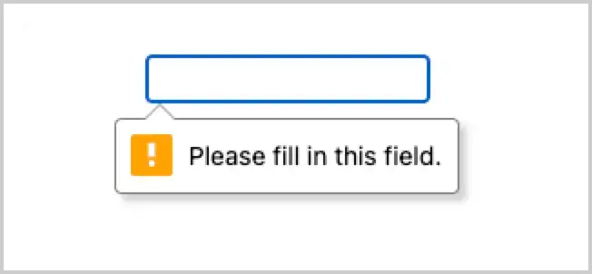
With some constraints in place, the form input will now be validated when the form is submitted and the browser will show a default error message.
For example, the following messages show in Chrome and Safari when a field with a `required` attribute has no value and the form is submitted:
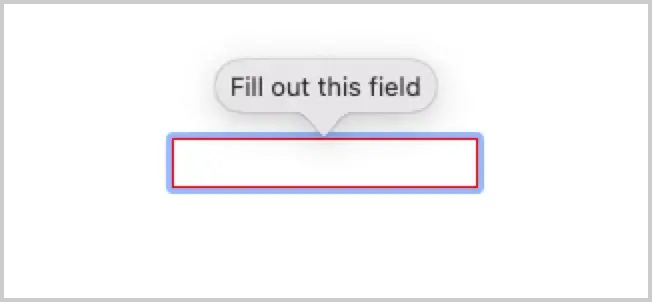
Both the text and the styling of the error messages are not consistent across browsers but luckily, you can change both.
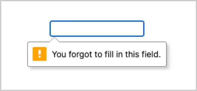
To change the text of the error message you can use the setCustomValidity() method of the field which takes an error message as its only argument:
const form = document.querySelector(‘form’);
const field = form.elements[0];field.setCustomValidity(‘You forgot to fill in this field.’);
Now the error message will show the text you specified:

The “invalid" event
To show your custom error message you can hook into the invalid event that is fired for every invalid form element when the form is submitted.
Note that if you don’t need custom error messages and you are happy with the default error messages the browser provides, you don’t need to set up this event handler.
The form fields that have constraints defined will be automatically validated when the form is submitted and a default error message will be shown for any invalid form field.
Let’s start by writing the handler for this event:
const invalidHandler = (e) => {
  const field = e.target;
  const validState = field.validity;

 if(!validState.valid) {
   field.setCustomValidity(‘This field is not valid.’);
 }
};
Now of course the message “This field is invalid” is a bit too generic and doesn’t tell the user why the field is invalid, but we can change that.
Recall that the ValidityState object of the field contains the reason why the field is invalid if the proper constraints are defined.
You can use this to determine the reason the field is invalid and show the correct error message:
const invalidHandler = (e) => {
  const field = e.target;
  const validState = field.validity;  // all possible error messages

  const errorMessages = {
    valueMissing: ‘This field is required’,
    tooShort: ‘This value is too short’,
    tooLong: ‘This value is too long’,    …
  };

  if(!validState.valid) {
    // loop through the error reasons
    for(let state in validState) {
      // find the first error reason with value “true”
      if(validState[state]) {
        // select the correct message for the error
        const errorMessage = errorMessages[state];
        field.setCustomValidity(errorMessage);
      }
    }
  }
};
In the above example, the possible error messages are stored in the errorMessages object.
We then loop through the error reasons in the validity property of the field that is stored in the validState variable.
When a reason is found with the value true, the error message is selected and shown.
While this works, it tightly couples the validation logic with the error messages that are now hard-coded into it.
A better solution would be to store the possible error messages in attributes. That way, the messages can be specified on the form control itself and the validation logic remains generic.
For example, you can store the error messages in data attributes.
The error message for a missing value of a required field could be stored in a data-valueMissing attribute so the correct message can be selected similar to the previous example:
<input
  type=”text”
  required
  data-valuemissing=”This field is required”>
The correct error message is then selected like this:
const invalidHandler = (e) => {
  const field = e.target;
  const validState = field.validity;

  if(!validState.valid) {
    // loop through the error reasons
    for(let state in validState) {
      // get the attribute name of the message for this error reason
      const attr = `data-${state.toString()}`;   // if this error reason has the value “true”

      if(validState[state]) {
        // get the error message from the attribute is it's present,
        // otherwise get the native error message
        const errorMessage = field.hasAttribute(attr) ?
          field.getAttribute(attr) : field.validationMessage;
        field.setCustomValidity(errorMessage);

        break;
      }
    }
  }
};
In the same way, you can specify different error messages for other form controls:
<input
  type=”number”
  name=”age”
  min=”18"
  max=”40"
  required
  data-valuemissing=”Please fill in your age”
  data-rangeunderflow=”You must be at least 18 years old”
  data-rangeoverflow=”The maximum allowed age is 40"
>
Note that the line:
const attr = `data-${state.toString()}`
constructs an attribute name like data-valueMissing (camel-cased) whereas the attribute itself is data-valuemissing (lowercase).
Since attributes are not case-sensitive, both will work.
The only thing that is now left is to invoke the invalidHandler function for each form field that is invalid.
You can do this by getting all form fields in the elements property of the form and looping over them to set an invalid event handler on each field.
You can loop over elements with forEach if you convert it to an array first:
const form = document.querySelector(‘form’);

// convert to an array
const fields = […form.elements];

fields.forEach(field =>
  field.addEventListener(‘invalid’, invalidHandler));
The event handler will now be invoked for each form field that is invalid, showing the appropriate error messages.
Validating Web Components
For this to work with your Custom Element, you will need to attach the ElementInternalsobject to it and add the following methods:
constructor() {
  super();
  this.#internals = this.attachInternals();
}

// add the following methods to make your Custom Element participate
// in form validation
get validity() {
  return this.internals.validity;
}

get validationMessage() {
  return this.internals.validationMessage;
}

get willValidate() {
  return this.internals.willValidate;
}

checkValidity() {
  return this.internals.checkValidity();
}

reportValidity() {
  return this.internals.reportValidity();
}
These methods are needed to make sure your Custom Element can participate in form validation.
However, this will not cause your Custom Element to be reported as invalid yet.
You will need to explicitly indicate whether or not your element is valid or invalid using the setValidity method of the ElementInternals object.
Let’s assume we have a Custom Element with the following Shadow DOM:
<style>
  :host {
    display: inline-block;
  }  input {
    padding: 5px;
  }
</style>

<input type=”text”>
Since your Custom Element has an <input> element internally, the validity of your element is derived from the validity of the internal <input>.
This means you will need to set the validity of your Custom Element to the validity of the internal <input> in two situations:
- when your Custom Element is first added to the page
- whenever the value of the internal <input> changes
You can set the validity when your element is added to the page in the connectedCallback lifecycle method and when the value of the <input> changes inside the change event handler.
You can write a validateInput() method for this which will be very similar to the invalidHandler we wrote earlier:
validateInput() {
  // get the validity of the internal <input> that is stored in the
  // property `#inputNode`
  const validState = this.#inputNode.validity;

  this.invalid = !this.pristine && !validState.valid;

  // if the input is invalid, show the correct error
  if(!validState.valid) {
    // loop through the error reasons
    for(let state in validState) {

      // get the name of the data attribute that holds the
      // error message
      const attr = `data-${state.toString()}`;

      // if there is an error
      if(validState[state]) {
        this.validationError = state.toString();

        // get either the custom of native error message
        const errorMessage = this.hasAttribute(attr) ?
          this.getAttribute(attr) : this.#inputNode.validationMessage;

        // set the validity error reason and the corresponding
        // message
        this.#internals.setValidity({[this.validationError]: true}, errorMessage);
      }
    }
  }
  else {
    this.#internals.setValidity({});
  }
}
We check the validity of the internal <input> and if it’s invalid we check if there is a corresponding error message defined in a data-attribute.
If the error is found, the validity of the Custom Element is set with the correct error reason and the corresponding error message.
Now the validity of the internal <input> will only be set if any constraints are set on it (required, min, max etc.)
Since these constraints are set on the Custom Element itself they need to be set on the <input> as well.
You can do this by getting each attribute from your Custom Element and setting these as properties on the internal <input>.
Let’s create an array with the names of the properties we need and loop over them.
Since the internal <input> also needs value, type, and placeholder from the Custom Element we will add those as well:
[
  ‘type’,
  ‘value’,
  ‘placeholder’,
  'autocomplete',
  ‘required’,
  ‘min’,
  ‘max’,
  ‘minlength’,
  ‘maxlength’,
  ‘pattern’
].forEach((attr) => {
    // ‘required’ is a boolean attribute without a value so we use
    // ‘hasAttribute’
    const attrValue = attr === ‘required’ ?
      this.hasAttribute(attr) : this.getAttribute(attr);

    if(attrValue !== null) {
      this.input[attr] = attrValue;
    }
  });
Now the only thing left is to call this.validateInput() inside connectedCallback and inside the change event handler of the internal <input>.
Let’s put it all together:
class FormInput extends HTMLElement {
  static formAssociated = true;

  constructor() {
    super();
    this.internals = this.attachInternals();

    const shadowRoot = this.attachShadow({mode: ‘open’});

    shadowRoot.innerHTML = `
      <style>
        :host {
          display: inline-block;
        }        input {
          display: block;
          padding: 5px;
        }
      </style>

      <input type=”text”>
    `;
    }

  connectedCallback() {
    this.input = this.shadowRoot.querySelector(‘input’);

    // set the required properties (constraints) on the internal
    // <input>
    [
      'type’,
      ‘value’,
      ‘placeholder’,
      ‘required’,
      ‘min’,
      ‘max’,
      ‘minLength’, // <-- camelCase!
      ‘maxLength’, // <-- camelCase!
      ‘pattern’
    ].forEach((attr) => {
        const attrValue = attr === ‘required’ ?
          this.hasAttribute(attr) : this.getAttribute(attr);

          this.input[attr] = attrValue;
       });

    this.input.addEventListener(‘change’, (e) => {
       // we also want to dispatch a `change` event from
       // our custom element
       const clone = new e.constructor(e.type, e);
       this.dispatchEvent(clone);

       // set the element’s validity whenever the value of the
       // <input> changes
       this.validateInput();
    });

    this.addEventListener(‘focus’, () => this.input.focus());

    if (!this.hasAttribute(‘tabindex’)) {
      this.setAttribute(‘tabindex’, ‘0’);
    }

    // set the initial validity of the component
    this.validateInput();
  }

  get value() {
    return this.input.value;
  }

  set value(value) {
    this.input.value = value;
    this.internals.setFormValue(value);
  }

  get form() {
    return this.internals.form;
  }

  get name() {
    return this.getAttribute(‘name’);
  }

  get type() {
    return this.localName;
  }

  get validity() {
    return this.internals.validity;
  }

  get validationMessage() {
    return this.internals.validationMessage;
  }

  get willValidate() {
    return this.internals.willValidate;
  }

  checkValidity() {
    return this.internals.checkValidity();
  }

  reportValidity() {
    return this.internals.reportValidity();
  }

  validateInput() {
    // get the validity of the internal <input>
    const validState = this.input.validity;

    // if the input is invalid, show the correct error
    if(!validState.valid) {
      // loop through the error reasons
      for(let state in validState) {

        // get the name of the data attribute that holds the
        //error message
        const attr = `data-${state.toString()}`;

        // if there is an error and corresponding attribute holding
        // the message
        if(validState[state]) {
          this.validationError = state.toString();

          // get the correct error message
          const errorMessage = this.hasAttribute(attr) ?
            this.getAttribute(attr) : this.input.validationMessage;

          // set the validity error reason and the corresponding
          // message
          this.internals.setValidity(
            {[this.validationError]: true},
            errorMessage
          );
        }
      }
   }
   else {
     this.internals.setValidity({});
   }
 }
}
Styling custom error messages
As you have seen before, the styling of the native error messages is different per browser and unfortunately, there’s no way to style these using CSS.
You can, however, use the same native validation logic to display error messages with custom styling.
This means that the native error messages will not be shown but the same error text will be shown as an HTML element that you choose.
To prevent the native error messages from showing, you need to call the preventDefault() method of the invalid event that is thrown by your Custom Element.
You can do this by simply setting an invalid event handler inside your Custom Element on itself:
this.addEventListener('invalid', (e) => {
  this.invalid = true;

  // when a custom error needs to be displayed, prevent the native
  // error from showing
  if(this.customErrorDisplay) {
    e.preventDefault();
  }
});
You also need to be able to set whether or not you want to show a custom error. You can do this by setting an attribute, for example custom-error-display and read this to determine the value of the property this.customErrorDisplay, which is used in the previous example:
get customErrorDisplay() {
  return this.hasAttribute('custom-error-display');
}
Now, the native error message will not be shown but the validity of the field is still set and the error message itself will be present in the field’s validationMessage property.
You can then use the value of this property (the error message), put it in an HTML element like a <div> or <span>, and show it anywhere you want.
You can then apply any CSS to this element you want and you have a fully stylable error message.
In the following example, a <div> with class “error-message” is created and field.validationMessage is set on it’s textContent property.
This <div> will then be appended to the parentNode of the field.
This assumes each form field is wrapped in another <div> so the field and the error message will be inside the same <div>.
You can then position the error message any way you like.
When the error is present, the resulting HTML will look like this:
<div class=”container”>
  <input type=”text” required>
  <div class=”error-message”>This field is required</div>
</div>
If the error is simply hidden when the field is valid, the error message doesn’t need to be appended each time the form is invalid.
The code can check if the error message is present and if it’s not it will be appended.
If it is, the textContent of the <div> will be set to the error message and it will be shown.
By default, the error message will have display: none so it’s hidden and when a field is invalid you can add an attribute invalid to it and add CSS to make the error message visible only when the field has this attribute:
.error-message {
  display: none;
}

input[invalid] ~ .error-message {
  display: block;
}
The general sibling combinator ~ is used here to select .error-message which is a sibling of input but only when it has the invalid attribute.
The attribute can be set or removed by simply setting this.invalid by creating a setter for invalid that takes care of this:
set invalid(isInvalid) {
  isInvalid && this.customErrorDisplay ?
    this.setAttribute('invalid', '') :
    this.removeAttribute('invalid');
}
Getting the error message is the responsibility of the consuming code. This code can hook into the invalid event to get the error message from the components validationMessage property:
<label>
  Input

  <form-input
    required
    data-valuemissing="This field is required!">
  </form-input>

  <div></div>
</label>

const input = document.querySelector('form-input');
const errorMessage = document.querySelector('.error-message');

input.addEventListener('invalid', (e) => {
  errorMessage.textContent = input.validationMessage;
})
When to validate?
The last issue to be solved is that validateInput() is called in the constructor to immediately set the validity of the component.
This may also set the invalid property to true which sets the invalid attribute.
If you indicated that you want to display custom error messages (through the custom-error-display attribute) this will cause the custom error message to be displayed before the user even interacted with the input.
Clearly this is not what you want.
You can add a pristine property to your component to prevent this. This property is initially set to true and you use that to only set this.invalid to true when the input is invalid and this.pristine is false (e.g. the user interacted with the component).
When pristine will be set to false depends on when you want to validate the input and display an error when applicable.
If you want to validate the component whenever its value changes then pristine should be set to false in the change event handler.
If you only want to display an error after the form was submitted pristine should be set to false in the invalid event handler, since that will only be fired when the form is submitted.
In the second case, the component will also be validated when its value changes after the form has been submitted.
This is good because whenever an error message is displayed, you don’t want it to disappear only after the form is submitted again but immediately when the component is not invalid anymore.
To indicate you want to validate the component whenever its value changes, you can introduce an attribute like validate-on-change for example:
<form-input
  validate-on-change
  ...
>
</form-input>
Here’s the full working example:
See the Pen Validation of form-associated Custom Element by Danny Moerkerke (@dannymoerkerke) on CodePen.
Conclusion
Form-associated Custom Element enable developers to build all types of custom form controls that can behave like native form elements and can be validated using native form validation.
Support for ElementInternals has not yet landed in Safari but has already been merged into Webkit.